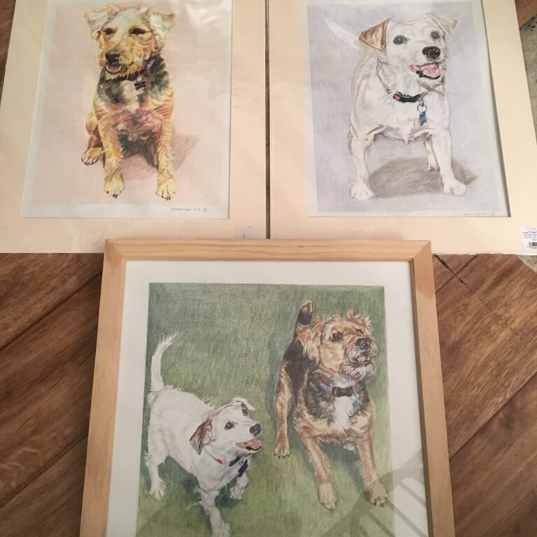
Framing At The Studio

September 13, 2017By adminSTUDIO No Comments

I’ve been so busy with a number of private and confidential commissions to undertake, and subsequent framing. It has been fun! They are now in the post or being stored for later delivery.

Many of the pieces have been surprise gifts for their loved ones so the subject matter has been close to their hearts – and so there’s an air of excitement about the final exchange.

So cue this week and lots of framing in the studio. I do recommend framing or at least mounting the work because framing really does let the work shine through. I am really pleased that so many clients have chosen this option. The natural colours and the rectangular shape of the frame accentuates the colours and the organic shapes of the artwork. There are a few ‘rules’ to get it right though…

I always like to include a mount at least 2 inches wide. I can’t imagine framing an artwork without one as it lets the image breathe, offering clean space away from the frame itself. This is especially important if the frame and attaching wall are quite different colours, because the frame will overpower the work, when you want the image to shine through.

I often recommend frames in white, gold or beige because these colours add warmth (white is not a warm colour although attributed to light) and ‘space’ (light colours help give add a sense of volume). Dark frames such as dark walnut or black can work, especially for more stylised images either line drawings or those with a lot of dark colour or chiaroscuro. Dark frames also work for pieces larger than A3, but are rather more dramatic and can take the limelight away from your artwork.

To make your piece really zing in the frame, most importantly you must consider the space that you’re creating the piece for. For more on this, see my next news piece.