Does The Quality Of Art Materials Matter?

August 30, 2017By adminSTUDIO

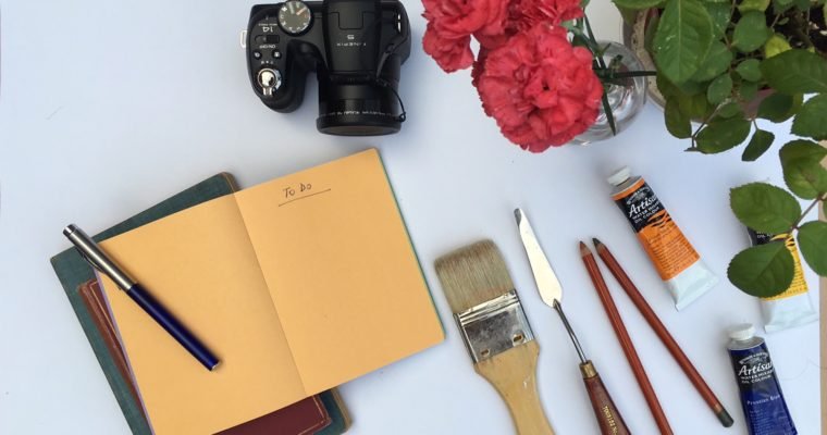
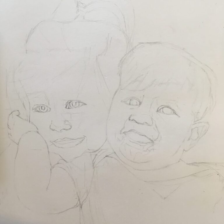
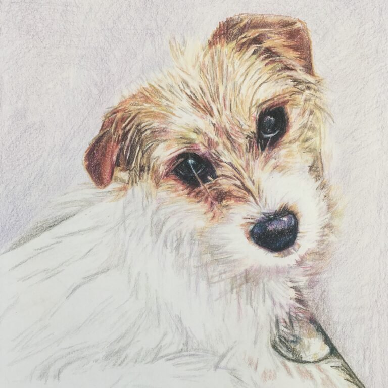
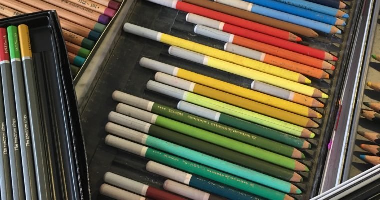
I often get asked what art materials I use. More often than not, people just want to know whether I use acrylic, oils, pencils or pastels. They don’t ask what make or grade of material I use. And they definitely don’t ask what canvas or paper I use.

Way back as an undergraduate, we were enrolled on a ‘Methods & Materials’ course on our Art History degree at UCL. Most of us thought it meant learning about the types of paints, pencils, graphites available, as well as archaic methods such as egg tempera and vellum, more associated with the renaissance and the medieval times.

Instead, the course opened a world of interest into the chemical makeup (hear me out) biodegradation and inherent quality of historic art materials. More like a forensic identification of the elements it took to make up pigments and surfaces , we looked at cross sections of paint samples to see the layers of paints and varnishes, to identify the compounds of the pigments, often made from metals, plants or, less often, animals . We also learned how well – or not – that paints, varnishes, canvases and paper had held up over the (often many) years. What that information told us about the artists’ methods was conclusive: the better quality and generally the more expensive materials, the better they have lasted.

And it is still true today. The better quality the art materials, the longer and in more pristine condition your artwork will last. The concentration of pigment, the binding in the pencils, the quality of the brushes used to paint all helps to produce artwork which lasts. As professional artists, it is our duty to offer excellent quality products.

Derwent, Daler Rowney and Rexel Cumberland and Winsor and Newton are all British art supplies brands, and overwhelmingly manufacture in the UK. They make excellent ranges ideal for professional artists, at the more expensive end, while also offering products for students, hobbyists etc. depending on your requirements.

Whatever your budget, however, the most important material to spend money on is the surface that you’ll apply the pigment to – i.e. the paper or the canvas. This will determine how your pigment sits and binds to the surface, and how well over time your artwork will last. After all, you want your client to be happy with their artwork for many years to come.

In terms of paper, some cheap paper is fine for sketching and practicing, but really for final artworks, I can spend from £2 to £10 on one sheet of paper for drawing, and for watercolour paper, much more. The cheaper the paper, generally the waxier the surface and therefore the less well the colour adheres, blends and stays on the surface. It only leads to disappointment for the artist and client alike!

For canvas, there are two things to consider – the frame and the canvas material. The frame will make the canvas wobble and lose shape, and will be hard during paint application as well as afterwards. The canvas material may bow, and the primer painted on the canvas material can also make it harder or easier depending on quality to let the oil or acrylic paint to adhere to the surface. You can also buy canvas without primer, which in some ways is better, because you can paint directly onto canvas, leaving a ‘bare’ look if you choose certain colour of thread, or it means you can use your own primer, which works best for the type of paint that you want to work with.

In sum, the quality of the materials is really important, both liquid and surface. And as a professional, neither should be scrimped on. But if you have to be frugal, the most important part to not save on is the surface – the paper and the canvas. Only then will your work stand the test of time.

Happy creating!

Working With Photos In Portraits

August 23, 2017By adminSTUDIO

Last week I started a new piece for a gorgeous client. A double portrait of her gorgeous toddler girls. When I consulted her about this piece in late Spring, we agreed to start work straight away to capture their youth while their faces are so quickly developing from their babyfaces.

So we scheduled a photoshoot. Pretty usual for my practice – cup of tea at their house, a chat and a introduction to the girls to get to know their mannerisms and take some pictures for reference. All was well – they are gorgeous girls and very well-behaved with beautiful manners (the tea was exceptional too – remarkable (see ‘I don’t thrive without caffeine’).

But. These little ladies would not sit still! Beautifully vibrant and full of life, apparently I had to see ALL of their extensive toys and plastic vegetables complete with mushroom and chicken. They were not in the mood for sitting still. Woe was me indeed!

Fortunately, their mother, my client, was happy for me to capture them in action. So I snapped away, various poses, engaging the girls and getting – quite frankly – some lovely pictures of their expressions, vitality and happiness. And Tomy’s back-catalogue.

When I came back from the studio I reviewed the photos, I realised that while I had some GREAT material, the final composition would work so much better if I patched two photographs together (a complete no-no in my book). I wanted to incorporate two almost-identical images, but with slightly different expressions of each of the girls in both.

‘…bugger!’ I thought. This idea put me way out of my comfort zone. After all, I’ve always drawn people ‘from the flesh’, in situ and/or from a single photograph after a fat to face meeting.

Moreover, I don’t like shortcuts in artists and was never keen or interested in merging photographs for reference (don’t get me started on contemporary art….). I’ve always believed that the energy in one photograph can never be replicated by merging two, especially when it comes to the energetic, dynamic pictures of people and pets. It would end up like a 15th century wooden staged pastiche of people’s faces. No thanks! Not satisfactory at all!

So I began to research. And actually I tested around with the photos and saw what I could come up with ( i was desperate). I was not going to be able to get new photographs, especially with the idea of time and growing not on my side – these girls were away for the whole summer growing up in a far away country and I didn’t have the option to revisit the photos. This HAD to work.

I’m coming to the end now of this work, and actually I believe it is my best portrait yet. Maybe it took more more than my located time to get there, but of the purpose of exploration and discovery, (not cutting corners for this very unique case) actually it has tested my mettle as an artist. Thanks to some careful – and time-consuming – trials and software manipulation, I think I got it covered. Now for the client’s verdict…..

Double Portrait – The Prep And Taking Photos Of Little Ones

August 23, 2017By adminSTUDIO

This is Lilly and Polly, they’re sisters and they are 2 and a half and 11 months old. Their favourite things are their mini-kitchen, their dollies and cuddles.

This double portrait was such joy to make because the girls had such love between them. Also, just using one final reference photo rather than multiple meant the energy and composition seems authentic and ‘real’.

Agreeing on the composition and how your client wants the image to appear is possibly the most important thing to get right when starting a piece. After showing the client some examples, we decided together that we wanted the girls to be embracing and ‘close’ in some way so that formed the basis for our approach to a photographic reference point.

It’s worth looking at art history for the many ways artists have depicted a double portrait (often to tell us a political or social story), such as romantic couples even where there is discord (think this by Hockney,  this by Van Eyck or this by Gainsborough), professional companions where there’s appropriate space between (think this by Holbein) or family members where a distance was portrayed (think this by Portinari, or this by Schadow).

To get my reference imagery for this portrait of sisters, I did a little photoshoot of both of them together for use back in the studio. This was far preferable than the girls sitting for me while I draw because at this age they are so expressive, they’re rather wriggly, and their attention spans are quite slim.

It took the girls a while to get used to the camera. I seem to get a good rapport with kids – but patience and earning their trust is key when on a photoshoot as it can be overwhelming for them. Fortunately, we ended up having lots of smiles and even more great pictures!

So what should you aim for when taking a photograph for an artwork portrait?

My goal for a studio-made double portrait is to select just one photograph to work in which they both feature. I would use the other photos as reference points for the individual detail – for example, to develop the fold of the clothes, the fall of the hair, the eye colour and the exact turn of the cheeky smile. But overwhelmingly, we need one photograph – mainly because the energy between the two subjects just works this way, and the colour reference, lighting and naturalness of the dynamic is obvious.

Another goal for me when taking photos is to have an image which is vibrant and natural, because my artistic style is to express ‘movement’, realness and energy. I won’t want to draw a picture where the subject is rigid and dour, I’d prefer a silly face to get the character of the person over.

Good luck with your double portraits and preceding photoshoots.

Meanwhile stay tuned to see how this double portrait ends up!

Meet Minnie The Greek Pup!

July 19, 2017By adminSTUDIO

Meet Minnie, a six month old Greek pup who is a little shy. I was asked to do this to celebrate her as a pup and it was a pleasure – a little different to do as she is a little more shy than other pups that I draw, also that I haven’t got to meet her in person yet, just via FaceTime and photos. (Commonly the case with my international clients). However, it was lovely to challenge myself with a new character to pooch life, in the shyness and dependency of a small one. This pic is now on its way to her owner in Greece!

Dog Portraits, Minnie - Sophie Nicoll Studio
Minnie the pup